This assignment was "Complementary Colors" when I first added it to my list - that's a popular technique in a lot of how-to discourses. I found it odd, though, that some folks listed complementary pairs in terms of paint colors - blue/orange, red/green, and yellow/purple - while others used the color wheel for light - blue/yellow, red/cyan, and green/magenta. So who's right? Could it somehow be both? Are there really just three color pairs that one should watch for?
I couldn't answer those questions until I read a few paragraphs by Anne McKinnell suggesting that the most compelling color pairs contrast a warm color (like red or yellow) with a cold one (like blue or green). I like that idea. It makes more sense than blindly following a color wheel and allows for the possibility that different shades of a color can have different temperatures.
Anne suggests using lots of one color with a splash of the other. I think she'd agree that that's not a hard and fast rule. I have also found that a certain amount of neutral colors in a photo doesn't necessarily interfere with the effectiveness of the contrast.

Freedom
In the sky over the Nickel Plate District Amphitheater in Fishers, Indiana
63
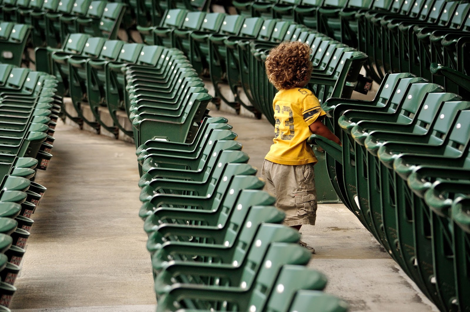
Nearly empty stands at Victory Field, Indianapolis, Indiana
No comments:
Post a Comment